|
|
Post by Wolverine12 on May 16, 2014 2:06:10 GMT -6
|
|
|
|
Post by Rok on May 16, 2014 5:01:48 GMT -6
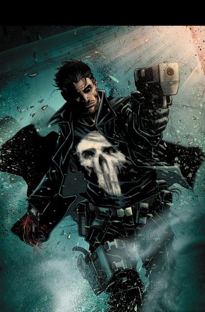
Doom is awesome. But damn the art and colours are bad.
|
|
|
|
Post by Mr_Monster_Munch on May 16, 2014 7:22:07 GMT -6
I'm not impressed by this. I'm scratching my head over how substantially worse the artwork has become. Take a look at this concept art by Mario Guevara. It looks amazing. But the preview shown above looks totally different. It looks so rushed. This substantial decline in the artwork is really noticeable and it's getting worse with every page released. I don't get it. Doom is awesome, and understandably so, but this isn't the reunion I was expecting, and it certainly doesn't look anywhere near as good as I hoped it would. |
|
|
|
Post by ty on May 16, 2014 20:16:31 GMT -6
The art looks meh but I like the dialogue
|
|
|
|
Post by Wolverine12 on May 16, 2014 23:40:36 GMT -6
I'm not impressed by this. I'm scratching my head over how substantially worse the artwork has become. Take a look at this concept art by Mario Guevara. It looks amazing. But the preview shown above looks totally different. It looks so rushed. This substantial decline in the artwork is really noticeable and it's getting worse with every page released. I don't get it. Doom is awesome, and understandably so, but this isn't the reunion I was expecting, and it certainly doesn't look anywhere near as good as I hoped it would. His line work (Guevara) is good, I think it's the inker and colorist that are giving it that funky feel. |
|
|
|
Post by wyokid on May 17, 2014 1:30:55 GMT -6
Art looks great to me
|
|
|
|
Post by Mr_Monster_Munch on May 17, 2014 16:51:20 GMT -6
His line work (Guevara) is good, I think it's the inker and colorist that are giving it that funky feel. See, last issue I would agree. But what I'm seeing here is what looks to me like something very rushed. The drawings are very scratchy and appear to me like they were drawn quickly, more like first sketches than finished pieces. The decline in the art's quality seems awfully rapid to me. The character drawings we got a few months ago looked bold and solid. And the first issue looked really good in places, but was spoilt by the bad colouring. These preview pages though (in my eyes at least) show a significant decline in the drawings. Hopefully it'll get better. This is just a preview after all. I just checked out some of his other comics online because I'm not familiar with his work. Wow, you're right. He is good. |
|
|
|
Post by spock on May 18, 2014 9:22:18 GMT -6
The art just isn't to my taste. I don't think I will keep reading with this artist, but I'll jump back on once he's replaced.
|
|